The same, but different

Graphics: Gelopolis
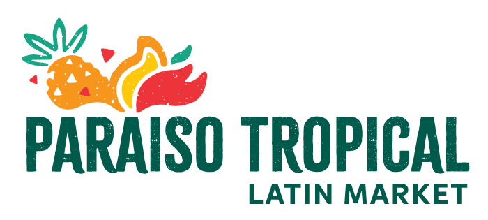
Those who have been to Paraíso Tropical’s social media channels may have seen the surprise that was recently unveiled: a rebrand with a fresh new look!
In fact, Paraíso’s management team has been talking of a rebrand for the last two years.
“We wanted more recognition in the Edmonton area. This is a family business that has almost been around for nearly 30 years, and we wanted to see how we could maintain the prestige and the hard work of [owner] Jesus [Gonzalez Rivas Jr.] and his family,” explains manager Natalia Marcenaro. “But we always want to keep the customers top of mind. The way we’re working right now is more modern in practice than it was years ago, so we also have to do this with the brand.”
Fellow manager Bruna Campos Gonzalez adds that before the rebrand, the store had a traditional look that the team realized might not appeal to current and potential customers.
“We felt like we were going at a pace that required a different sort of image for our customers,” says Campos Gonzalez. “We wanted to better match the image that we have of Paraíso – of what we’re becoming in our minds – to how we look on the outside.”
The two managers, along with Gonzalez Rivas Jr., then began to turn their wishful thinking into action near the end of 2019 to see what they could do and who they could work for the rebrand process.
The team worked with local graphic designer & illustrator Gela Cabrera Loa of Gelopolis, who is originally from Mexico and whose rebrand and website design work includes Sangea Academy, an Edmonton-based West African drumming & dance group.
Continuing On Despite COVID-19
Shortly after deciding to begin the rebrand process, however, the COVID-19 pandemic happened.
“There was that ‘Oh, okay. Is it the right time to do [the rebrand]? Or is it not the right time to do it?’” Gonzalez Rivas Jr. shares. “But, in retrospect, ‘Yeah, definitely. Why not?’ Like the situation is not ideal. Businesses are struggling, but what better time – at the same time – to show that we are growing and adapting to the changing culture, to the changing times and that we can still provide? We can still keep moving forward.
So the pandemic wasn’t really a reason to stop us. If anything, it was a reinforcement of how we need to constantly readapt.”

Photo: Rubén Contreras
The rebrand process proceeded with Cabrera Loa sending the Paraíso team a questionnaire to help inform the kind of design that the team was looking for.
“Gela came back to us with different options and then we would review them as a team, then review it with her, and we went back and forth with it,” says Marcenaro.
“[Jesus] sent the design options to [his family] and they had their input for sure,” shares Campos Gonzalez. “I think it was a great decision on Jesus’ part, because it makes it more personable and [ensures] that everything is running with the same values.
His dad was like, ‘We cannot let the muñeca (lady; literally ‘doll’) go. She’s our mascota (mascot). She’s our brand character.’”
The Strong Attachment to Nostalgia
When each person from Paraíso’s decision-making team was asked what they learned or what surprised them the most, the resounding answer was…
“How attached we are to [the lady], hey?” admits Campos Gonzalez. “We’re attached to her.”
From those who have seen the rebrand video that also gives ode to Paraíso’s past logos, one learns that the lady carrying the basket of fruits on her head has been around since the beginning. But what was the inspiration behind the image?
Being too young to know why the image came to be, Gonzalez Rivas Jr. took the time to ask his father Jesus Gonzalez Rivas Sr., who started Paraíso Tropical with family friends in 1991 as a business catering to other Salvadorans in Edmonton. The first logo was created by one of the family’s business partners.

2009 version of Paraíso Tropical’s brand character
“The idea is that [of] the woman at the market who’s always selling her food items through a basket – whether it’s bread, tamales or whatnot. In the mornings, you will see the ladies just walking around and selling their food items,” Gonzalez Rivas Jr. explains. “The idea was to present that [Paraíso Tropical] is a food market and this is what used to be in El Salvador. This is what you see in all of Central America – all of Latin America. So that’s where [my parents and their business partners] wanted to convey that: through that logo.”
Gonzalez Rivas Jr. further explains his strong attachment to the previous logos’ main character.
“That is also kind of representative of the Indigenous roots that we see in all of Central America and South America in some way or form. You always see the traditional street vendors that are selling food on the streets, and you’ll see a lot of them through the Indigenous peoples. I’ve travelled through different countries – Colombia, El Salvador, Guatemala, Brazil – and everyone has a slight variation of that.
“Why I like that logo [with the lady] is because it’s still a great way to represent the work ethic and the Indigenous roots of the traditional foods represented in those countries. There’s been talks like, ‘Oh, we don’t need [that image],’ but I’m like, ‘No, I think that’s a vital part’ – not only because it’s been there since the beginning – but because I think it represents something more. And I think a lot of people don’t really understand what it represents at the same time. So if we can show that part of the heritage, that’s great.”
The Logo’s Evolution During Paraíso’s 29 Years
Paraíso Tropical’s logo, in the beginning, was black-and-white and hand-drawn.
“As the years went on, some other designer had to redraw [the logo] for a letterhead or sometimes, we used that image for the windows. [Another] one was a business card,” Gonzalez Rivas Jr. explains. “And so someone always gave us a slightly different variation. Someone always gave their special touch to it.”

Paraíso Tropical’s 1999 letterhead
“[The logos] just kind of evolved by adding more colours and whatnot. When I came in [as the new owner in] 2009, I thought it was time for a serious rebrand and give [the logo] an image that you can actually use for vector arts, that you can use on the computer – jpeg image and stuff like that – something with a better resolution, so more colours and more of a feel to it,” says Gonzalez Rivas Jr. of the 2009 version of Paraíso’s logo.
Marcenaro adds that in addition to being attached to the logo’s character, the team learned that – despite having an idea of what they wanted in the beginning – their thoughts changed as they were taken through the rebrand process.
“When we saw the different versions [of the logo design], we could acknowledge that we didn’t want what we wanted at first.”
Cabrera Loa shares that her challenge was trying to keep the look and feel of the store and its community and philosophy, while trying to make a simpler logo at the same time.
“It was hard for us to decide to take out the lady, but we did it to avoid having a very complex logo that is gonna cause trouble for printing and reproduction, and it’s gonna have issues with size,” says Cabrera Loa. “Like the more complex [the logo] – if you print it in a smaller size – it loses legibility.”

Photo: Rubén Contreras
What Changed & What Remains?
The new logo’s fonts has been redesigned so that they are easier to reproduce with new digital and printing techniques.
“We gave the logo an [artisan rustic feeling]. We kept the abstractions of tropical elements and kept it colourful. And to make it look more memorable and easier to reproduce, we decided to take out the lady and keep her as a character of the brand,” Cabrera Loa explains, who also looked to Salvadoran artisan crafts for inspiration. “I tried to [give the new logo] a handmade look. The handmade lettering and signage – you can find that in the street markets in Latin America with the retro and vintage look.”
“We maintained the fruits, like maybe not the exact fruits, but the concept of the fruits, because the name is “Paraíso Tropical”. So when you’re thinking of a “Paraíso Tropical”, you’re thinking about a lot of fresh fruits – something natural, something that you can buy in the markets,” tells Marcenaro.
“The lady – that’s the one thing that’s not the same, ‘cause normally, the fruit are on the top of her head and she’s in the centre. So what we’ll do is we’re gonna use her at the side as a mascot.”
Meanwhile, Gonzalez Rivas Jr. points out that having the community see themselves reflected in the image is important as well.
“We want to respect and cherish the Indigenous feel. I feel that the latest one that we have here kind of goes back to that and shows us more facial characteristics that are more representative of Indigenous history in Latin America.
“A lot of the times…what I think Gela was saying was that we like to give recognition to this, but when it comes to actually doing, we want to make it look like North American or European standards of facial recognition. So I think [Angelica] did a good balance in not only representing the [Indigenous feel] but giving [the rebrand] a really good, more modern twist.”

Photo: Rubén Contreras
Community First
The Paraíso team hopes that, when people see Paraíso Tropical’s new look, they can still recognize the business that they have known for nearly 30 years.
“We also want them to [see] that we’re Latinos representing all Latin American products, people and countries – to feel that what they had back home, they also have it here,” says Marcenaro. “We also want to see how we can engage with the Canadian community more, so that they [can experience] como un recorrido por nuestra cultura (like a tour of our culture).”
“I think it’d be really nice [to have people] still remember the history of our business with my mom and dad being at the forefront of it. I want that history, the attachment to it, the nostalgic feel it provides,” adds Gonzalez Rivas Jr. “But I also want them to see that we are changing. You know, it’s a new generation. It’s a new team of people we’re now working with and we’re looking to improve in all ways.”
Gonzalez Rivas Jr. looks forward to providing more diverse products in the future and perhaps, having different departments at Paraíso – a bakery, for instance.
“If we’re gonna grow this way, what better time to use this rebrand as that launching point as well. While [people] do know who we are, we want them to know that we’re different as well. We’re better.”
If you missed the rebrand video, you can check it out below!
#paraisotropical #rebrand #behindthescenes #culture #blastfromthepast #history